HERE Global Relief

Pairing technology and meditation to improve the mental health of everyone, everywhere.


CLIENT
HERE Global Relief is a social enterprise combining science and meditation with a “mission to ease human suffering with digital treatment technologies that help humanity triumph over trauma”.
In 2018, a free app was released by HERE to provide mindfulness and relaxation exercises to the masses in order to improve mental health and wellbeing on a large scale. HERE's app is free but it raises awareness of their foundation which raises funds for trauma therapy and other outreach activities around the world.
Image: HERE's two existing exercises

OVERVIEW
BRIEF//
The problem that HERE faced was a lack of user engagement. With an upcoming corporate rollout and pending university study, HERE needed to implement new exercises to improve their user experience so that they could continue to raise funds.
The goal was to encourage people, both new and experienced, to utilise HERE's meditation exercises and incorporate them into their daily routine to improve their overall mental health and wellbeing while learning new mindfulness habits.
HERE stipulated that the exercises must:
-
Incorporate science-based components
-
Use ownable, distinguishable HERE visuals
-
Include helpful onboarding instructions
-
Take into account the optimum viewport experience
-
Have been sufficiently user tested
-
Consider the group experience of interactive exercises
-
Be ready to scale across all platforms via Flutter
OUTCOME//
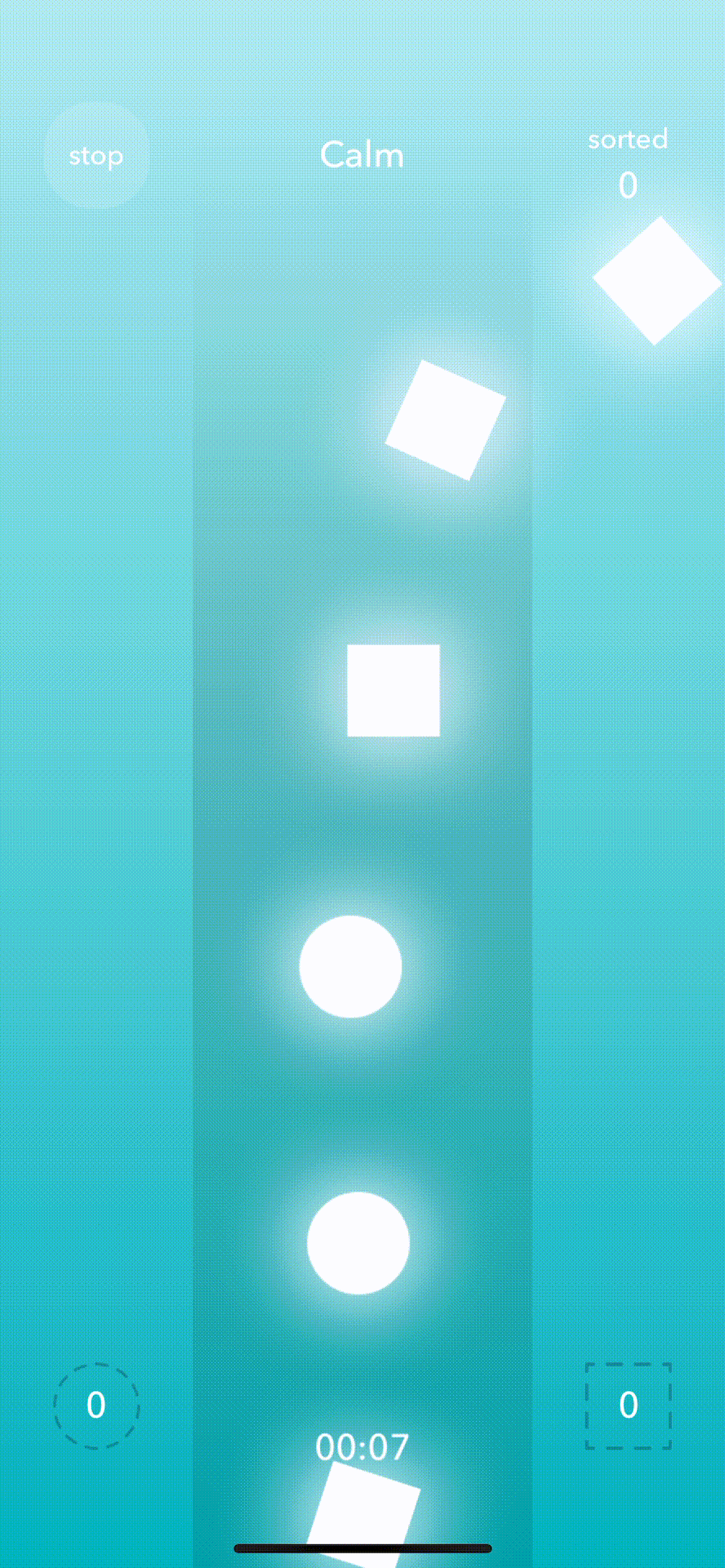
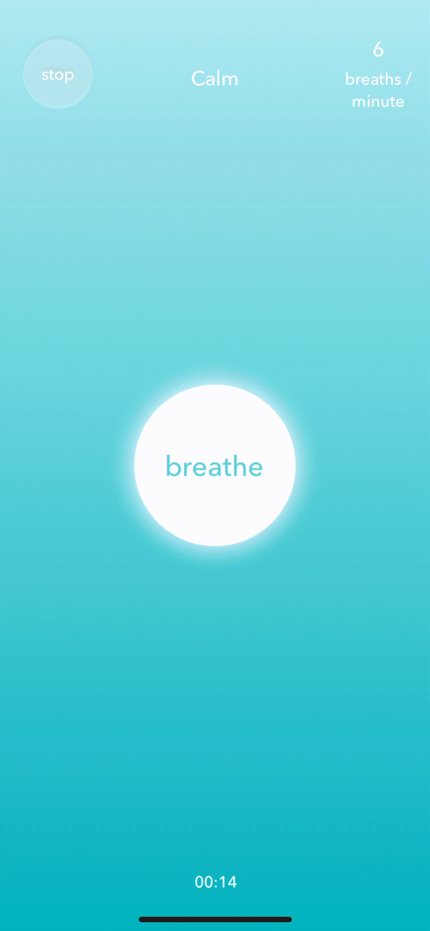
Five meditation exercises, incorporating extensive scientific research and vector art, to give users a simple way to incorporate calm moments into their day. The exercises created were made to be scalable across all platforms using Flutter.
HOW MIGHT WE?//
-
Incorporate science-backed interactions into the designs?
-
Make each exercise a delightful and immersive visual experience?
-
Convey the instructions and benefits of each exercise clearly so users never feel lost or confused at any point?
-
Track how users feel after using the app?
-
Encourage users to adopt these exercises in their daily life?

RESEARCH
We identified the main challenges our target users had by interviewing a pool of 12 professionals aged between 26 and 32 as this fit HERE’s corporate target audience and asked questions about stress triggers, how they switch off, peaceful memory recall, mental imagery, their experience of interactive exercises and games and how they interact with others. Then we researched and analysed competitor wellbeing and meditation platforms along with a mobile game app, as well as usability testing HERE's current exercises to understand what was working from a usability standpoint and what was missing so that we could optimise the experience in HERE's new features.
KEY FINDINGS//
-
100% of people interviewed identified their happiest core memory as nature-related
-
Passive activities (reading, watching TV, listening to podcasts etc) are preferred by users with a 75% majority, as opposed to Active activities (exercise, learning new skills etc)
-
Vector graphics are trending amongst competitors
-
Interactions should be kept simple so users feel in control of their experience
-
The most common causes of stress (in order) are work-related, personal relationships and lack of self-care regimen.
-
Users enjoy the social and escapism aspect of gaming but worry about losing or becoming addicted
-
Tooltips are a useful implementation to inform and educate users on the benefits and purposes of exercises
-
The majority of participants did not feel comfortable meditating in front of colleagues so mobile viewports would be prioritised for accessibility on-the-go or in private

IDEATION
We held a design studio to brainstorm ideas and included the client and one of their other UX designers to maximise ideation potential. (It's always great to get the client on board to include them in our process - this enabled us to gather over 50 ideas and also had the benefit of building a strong relationship and strengthening communication with the client).
From our research we knew the exercises needed to be nature related, relaxing, accessible regardless of location and engaging without crossing the line into being addictive.
Ideation was done following the "crazy 8" structure. From this, five exercises were collectively selected for development based on their interactions.
We implemented the key findings from our research and made three iterations of the exercises from low fidelity, mid (with animations, which we tested) and high, which was handed over to the client at the end of our project.

TESTING
We usability tested the exercises on 7 participants remotely via zoom to address if users understand the purpose of each exercise, whether they feel the benefits and their thoughts about the exercises and what could be changed.
We also asked our participants to rate the exercises from 1-10 and to rate the exercises using the new feedback loop to get both qualitative and quantitative data.
KEY FINDINGS//
-
The onboarding screens needed less jargon-heavy copy
-
The breathing pace was a little fast on some of the exercises and needed to be adjusted to give an optimum experience
-
The visual design needed to be standardised across all exercises
-
Accessibility needed to be addressed on the feedback loop due to the pinch interaction and the emojis needed a more nuanced range of emotions.

HIGH FIDELITY DESIGN
COLOUR PALETTE AND ASSETS//
The colour palettes were selected based on HERE's soon-to-be-released update, with a magnolia tone that showed up repeatedly throughout competitive analysis to tie together all of the exercises. Each exercise had an individual palette but all worked cohesively.
Most of the assets were a combination of the pen tool and other pre-existing assets. In terms of the design style, we went for Vector due to the time constraint of the project (however, keep your eyes peeled at the end! I made a re-rendering in my Poly art style. The co-founder of the company booked me to deliver a tutorial after our project had lapsed and this could be HERE's next style...)
FINAL PRODUCT//
With all prior research in mind, we moved onto implementing all of our recommendations to the high fidelity stage.
We would focus on standardising the visual design, improving the animation functions and pace of the exercises and ensuring that the onboarding screens would be as easy to interpret as possible.
A few constraints we had to bear in mind were:
-
We only had Figma to animate with
-
We had just one week to finalise exercises from mid to high fidelity to deliver an MVP
-
The exercises needed to be HERE-ownable and unlike any other apps, while still being low-stimulation and minimalistic for our users to focus on the meditative experience
-
There was no scope for further usability testing due to the strict time frame (although HERE would continue this post-project before implementation) so we needed to take all prior research into account very carefully to optimise the user experience as much as possible before handing over to our stakeholders.
NEXT STEPS
The animations have been handed over to HERE’s team for animation artists to complete the exercises and will then go through further testing cycles before being implemented within the app. The work my team has done will also form part of a university study and I'm following HERE's progress closely to see the results.

WHAT DID I LEARN?
-
Figma proved itself to be an incredibly useful tool for art creation and animation, despite this not being its primary function.
-
Due to the out-of-the-box aspect of this project, I had to learn on my feet and not only analyse user data but also delve into scientific research to give the best possible result to our target users.
-
This project has given me an insight into how I can implement subtle but effective meditative aspects into the apps I am developing to not only give users a brilliant experience but to also improve their overall mental health. This isn’t just applicable in mindfulness apps and can be implemented across any interactive interface.